

Today’s Google Doodle came as a surprise, bringing a new vibrant, playful and bold logo to represent the Search Giant. The company decided to adopt a new logo for Google, which will be eventually rolled out to other products that operate under the new Parent company ‘Alphabet,’ unveiled last month. It might won’t affect any current services that you’re using, but it changes the very fabric of this company. It is one of the most dramatic and noticeable change ever since the company decided to ditch ‘backrub’. Here are the 5 facts about Google logo history, you should know about.
Creepy BackRub Logo

Google wasn’t launched with a perfect name back in 1996. The company was formerly known as ‘BackRub’ – the web crawler. It even flaunted a creepy logo, featuring a bare back of a hand with less cartoony, simple text written over it. It was rebranded as ‘Google’ a year later.
Original logo designer wanted it to be “Non-Designed”
![]()

Once the company was rebranded as ‘Google’ in 1997, Larry Page and Sergey Brin decided their pre-launch logo wasn’t enough to represent the search engine, which was hard to read as well. The Original logo was designed by Ruth Kedar a year later in 1998.
Google started using Doodle
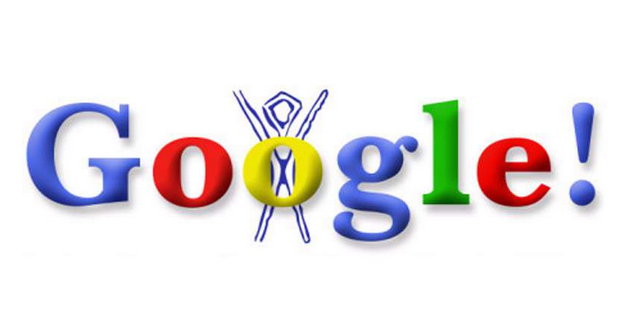

Google dropped Exclamation point
![]()

The new Logo adopts design from Alphabet


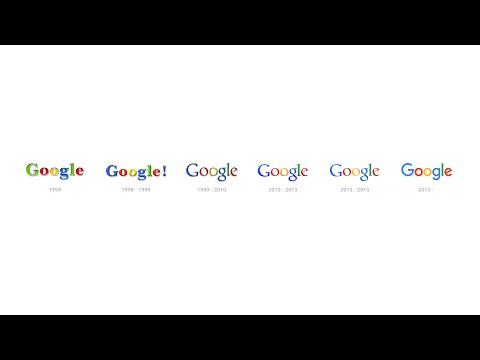
A brief Google logo history:


